Struggling to convert to your online store? You certainly aren’t alone. Any eCommerce expert will tell you, trying to get existing traffic to convert is a common problem. You need to optimize your site and improve the user experience to increase conversion rates. For many online stores, the most important conversion will be a customer making a purchase. However, conversions can extend to other actions like adding an item to the shopping cart/wishlist or creating an account.

Optimizing your store to increase conversions can come easy if you follow some simple methods that can guarantee success no matter your store’s niche.
Optimize your store for mobile
Optimizing strictly on your eCommerce store’s desktop view is a common mistake to make. After all, it gives you a bigger visual space to guide your customer and fill the screen with your brand colors and images. Google even prioritizes indexing the mobile site before desktop so optimizing for mobile should be a high priority part of developing your online store.
If you haven’t optimized for the mobile version it can lead to your store not displaying properly on the smaller screen. Developing a mobile version of your site will go a long way to improving your eCommerce conversion rates. By reformatting the website for a vertical view (rather than a horizontal view for desktop) you need to make sure text is readable, call to action (CTA) buttons are clearly defined, and your page elements aren’t overlapping with each other. This all goes towards improving user accessibility, if your user can easily interact with your site on mobile then they’re more likely to convert.
Improve your page speeds

Does your page take too long to load? This will negatively impact your conversion rates. According to Cloudflare, 47% of users expect a site to load within two seconds. Customers these days want instant access to the products they’re searching for. Browsing for items and the entire checkout process on your eCommerce store should be a speedy process.
To know how fast your pages are loading, use Google’s Page Speed Insights tool. It’s completely free and allows you to analyze the speed of any page on your website. The tool rates a page out of 100 to let you know how much room for improvement there is to speed up your page. The rankings range from:
• 80 and above = Good
• 60 to 79 = Average
• 0 to 59 = Bad
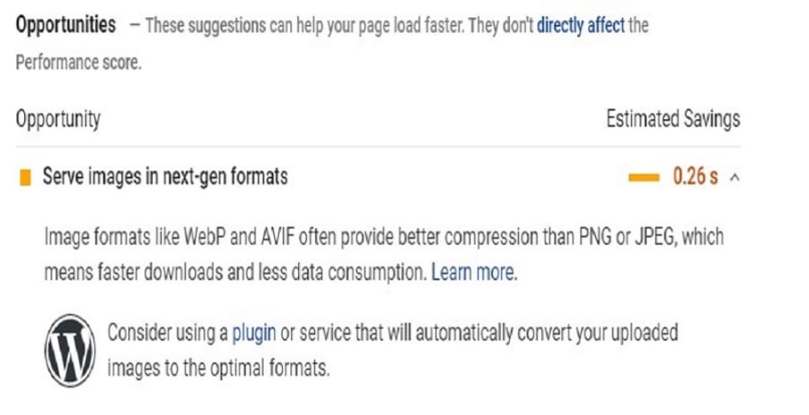
Page Speed Insights also gives you data on how to improve your page speeds. Under ‘Opportunities’ you’ll find a series of issues on the page that can be fixed. One of the most common issues is reducing the file size of images on the page. The bigger the size of the image, the longer it’ll take the page to load for users. Some of the issues may require a web developer. In any case, making sure your pages load fast gives users instant gratification that goes a long way to making them convert to your store.
Using loss aversion to your advantage
A simple but effective method of increasing your eCommerce conversion rate is to use loss aversion on your product pages. In simple terms, loss aversion is a way of reassuring potential customers that they will lose nothing on the purchase they make.
For example, some customers don’t want buyers’ remorse after buying a product so offering a money-back guarantee can be a great way to ease their minds. Similarly, if your online store offers returns then it’s a good idea to reinforce this in the product descriptions on the page.
A small bit of information like this can give users confidence in their purchase and go a long way to increase conversion rates. It’s easy to implement and highly effective.
Experiment with A/B testing
When you’re looking to make a visual design page on any page of your eCommerce store then A/B testing is essential for making sure it increases your conversion rate. Let’s say you want to change your ‘Buy it now’ CTA button from red to green. A simple change but how can you be sure this change will increase your conversions?
Setting up an A/B test is when you test your original page against the updated page with the CTA color change to see which one gains more conversions over a period of time. Hopefully, at the end of the test, the updated change is the more successful one but bear in mind that sometimes the original will be getting higher conversions. In any case, you can find out a lot about what works and what doesn’t work with your target audience. Google Optimise is an easy platform to test design changes such as this so be sure to keep testing and testing.
Keeping your eCommerce converting
Optimizing your online store using any of these methods can go a long way to increasing your eCommerce conversion rates. Of course, there are constant trend changes that introduce new design changes in the industry so be sure to keep on top of them and experiment with what works for your store. With constant testing and creative ideas, you’ll see your conversion rates rising in no time.
